
My Heart's Cry

My Heart's Cry is a Christian ministry brand built around Kim Griffin's blog - with a future podcast and books planned - offering everyday prayers and life-skills/homemaking content for Christian women. Kim came to 95Visual for a logo and brand identity to give the ministry a visual home.
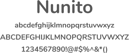
Kim came into the discovery process with unusually specific references - naming Bloom (Providence Women's Ministry) as a favorite for being "simple, soft, clear... feminine touch," and flagging generic, low-color marks as dislikes. She asked for soft tones that would sit well on a floral background (blues, yellow, grey, green, pink) and a sans-serif-first direction, balanced with a request to reflect "sharper lines" trending in design while keeping a soft touch "because we are talking about the heart." The logo went through four rounds - exploring four typeface/color directions in Round 1, narrowing to a blue-and-yellow palette in Round 2, refining icon contrast and capitalization in Round 3, and finalizing type case in Round 4 - landing on a heart icon that replaces the apostrophe in "My Heart's Cry," set in Nunito.
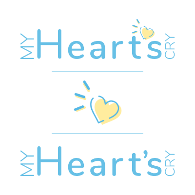
Full lockup, standalone heart icon, and plain-apostrophe fallback for low-contrast use cases.
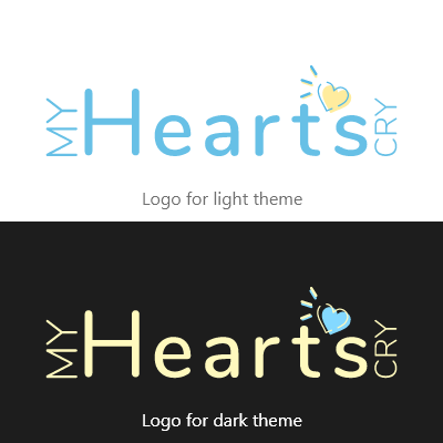
Defined clear-space rule, proper/improper use, light/dark/grayscale/inverted variants for print and digital.
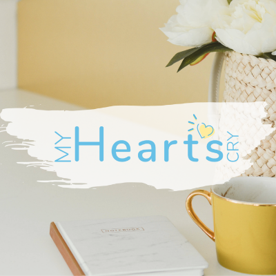
Business cards, brochures, stationery, social media banners, and a custom podcast button graphic.